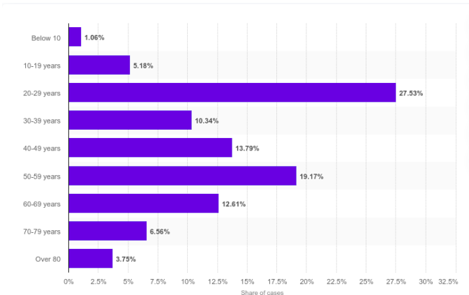
Over 40% of tested individuals were younger than 40. Given that the sample is biased towards
people that have reported symptoms it seems like a reasonable assumption that the number of people that are showing no symptoms is 2 times higher than those that have mild to more extreme symptoms. There may be sociological reasons for the larger prevalence of carriers among younger people in the Korean data as they seem to engage in more social interactions.
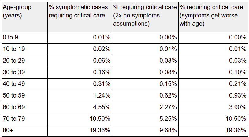
Given this we can divide the reported mortality rate by 2 derive the population wide mortality rates, although for older people it may be that the disease is less likely to express asymptomatically, and therefore the numbers may be more accurate.
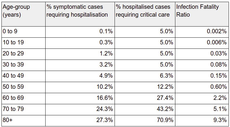
Strength of health system: I have written previously that the main risk factor from this pandemic is the lack of preparedness of your local health system. The high percentage of patients respiratory failures limits the ability of the health system to provide an effective treatment because of the low number of ventilators. In countries like the UK, where healthcare investments have been abysmal for the last decade, the available number is a small percentage of what is needed to provide the required support. The strength of your local health system may be better than the average status of the various healthcare systems used for the mortality statistics provided in the table, or not as good. From a practical point of view this provides a higher bound on the number of infection fatalities. This is the worst case scenario, which is too far from the current situation in the UK. To derive the upper limit for fatalities we can assume that everyone that will need acute care will pass away due to lack of ventilators. This is probably the situation in some areas in Italy.
Given these two considerations I compiled the following table that is based on the Imperial College article. It shows the percentage per age group of patients needing treatments. In the most extreme cases this will be close to the actual fatality rate of COVID-19. The next column shows the same rate divided by 2, based on the assumption there are twice as many infected people thanthe number reporting symptoms. My personal opinion is that for the older age brackets the worst case scenario will converge towards the first column. To model that I added a third column with a simple linear model that reduces the number of asymptomatic cases from twice the number of symptomatic cases by the 70+ age bracket: